Witness: Localizing True Crime
Overview
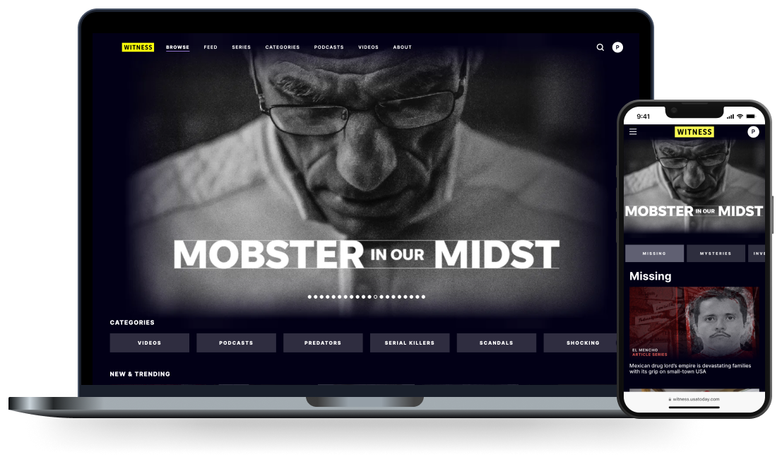
Market research has shown a demand for well-reported true crime stories, and Gannett has a vast collection of evergreen true crime reporting from USA TODAY and hundreds of local news sites. We wanted to create and monetize a site that was part news, part entertainment featuring true crime articles, podcasts, and videos.
Objective
Create a new website to aggregate real investigative and archival reporting from 200+ local news sites and USA TODAY that can attract a growing true crime audience.
My role
I led work on:
Timeline
Market research has shown a demand for well-reported true crime stories, and Gannett has a vast collection of evergreen true crime reporting from USA TODAY and hundreds of local news sites. We wanted to create and monetize a site that was part news, part entertainment featuring true crime articles, podcasts, and videos.
Objective
Create a new website to aggregate real investigative and archival reporting from 200+ local news sites and USA TODAY that can attract a growing true crime audience.
My role
I led work on:
- Usability testing
- Content architecture
- UI design
- UX copy
Timeline
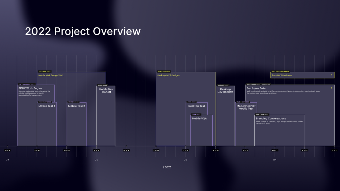
Market research and initial design work on this project began in late 2021. I began work as the product design lead in late January 2022 to validate content architecture, navigation, design, and the content itself. This was a mobile-first project, as we initially thought this would be a standalone app.
We worked on a tight timeline and passed of the tested MVP designs in early April 2022. As the project gained momentum, the scope expanded to include desktop designs and we had additional time to refine both experiences based on user testing feedback.
We worked on a tight timeline and passed of the tested MVP designs in early April 2022. As the project gained momentum, the scope expanded to include desktop designs and we had additional time to refine both experiences based on user testing feedback.
Process and methodology
We conducted unmoderated usability testing through UserTesting.com. We screened for news readers who selected true crime as one of their top news categories, who read true crime news at least once a week, and who engaged with at least one other true crime source, such as podcasts or streaming shows. The site was tested with 45 true crime fans across 5 usability tests, and the team collected about 60 pieces of on-site feedback through employee beta testing.
Testing themes and challenges
1. The site needs to look newsier.
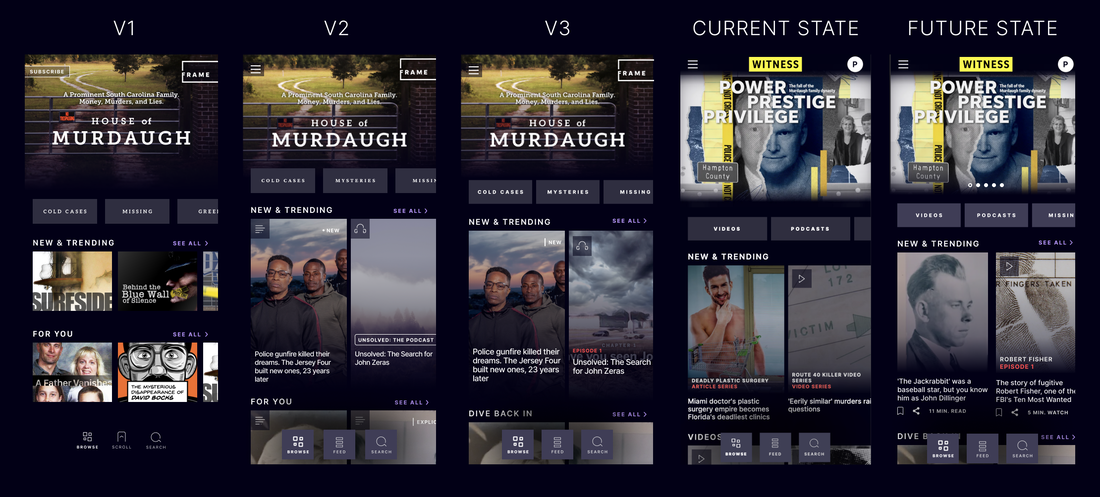
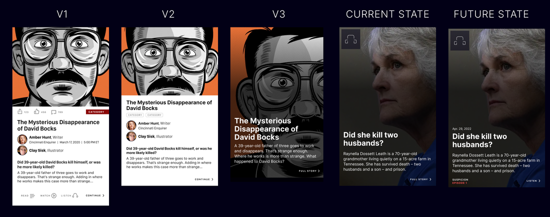
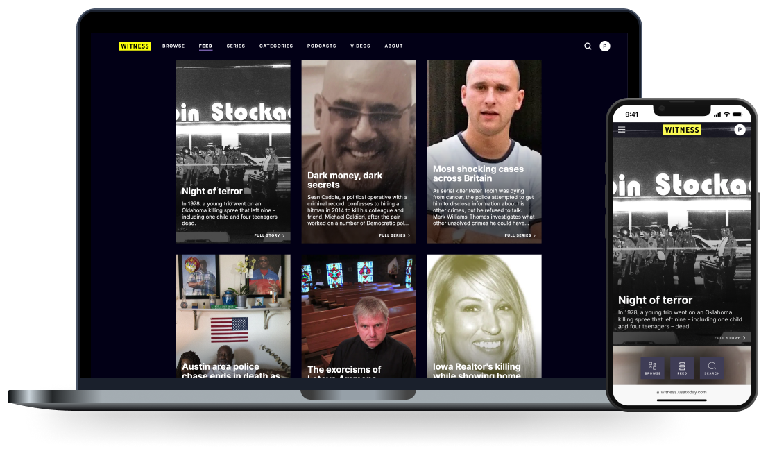
50% of users on the first mobile test said the design looked like Netflix. This contributed to user confusion about whether the featured content was articles or videos. 70% preferred articles with headlines rather than the stylized images, noting it was more descriptive and helped them choose what to read.
2. Testers browsed by category first, then content type.
Across tests, at least 90% liked browsing by category and 100% understood how category filters worked. When asked what they would click first, users consistently browsed the category carousels to find content they were most interested in.
In beta testing, users expressed frustration that they couldn’t also filter content by type. We added Podcasts and Videos to the navigation and as content filters to very positive feedback.
3. Navigation needs to be consistent and structured.
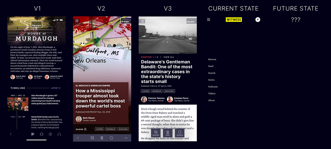
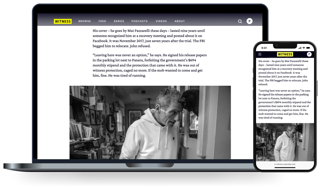
The first two tests used a different navigation on articles than the rest of the experience. 65% struggled to navigate from an article back to another page because of this. When the beta first went live to employees, we received numerous complaints that the bottom navigation covered content on smaller phones. We resolved this by making the bottom mobile navigation slightly smaller, and by adding navigation links to a hamburger menu for parity with the desktop experience.
The first two tests used a different navigation on articles than the rest of the experience. 65% struggled to navigate from an article back to another page because of this. When the beta first went live to employees, we received numerous complaints that the bottom navigation covered content on smaller phones. We resolved this by making the bottom mobile navigation slightly smaller, and by adding navigation links to a hamburger menu for parity with the desktop experience.
4. Content labeling needs to be more obvious.
We designed under the assumption that most MVP content would be articles, and article series would be promoted separately. Both of these assumptions were wrong!
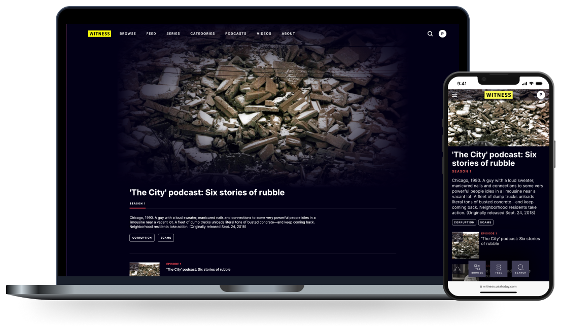
Witness includes both standalone articles and content that is part of a larger series. Initially, we called these “cases” instead of series because we felt the word series was too strongly correlated with video. However, the need for clearer labeling identified in beta testing led us to use “series” for consistent labeling across content types.
Even after adding labels, mobile users struggled to identify content type on the beta site, while desktop users identified content types easily. Our hypothesis is because the font size was bigger, they were more noticeable, so we are increasing the font size on mobile and plan to test again.
5. Every asset needs a byline.
In the last beta test, we added an About page explaining where site content originated and our mission. 40% of testers said they cared more about the credentials of individual journalists than the publisher. While articles had bylines, podcasts and videos did not due to dev constraints. We are working to add bylines to all content.
Outcomes
Witness is slated to launch as a standalone subscription product by mid-2023. We are waiting on the implementation of a new checkout flow to ensure the subscription process is as seamless as possible.
Witness is slated to launch as a standalone subscription product by mid-2023. We are waiting on the implementation of a new checkout flow to ensure the subscription process is as seamless as possible.

