Account Management Redesign
Overview
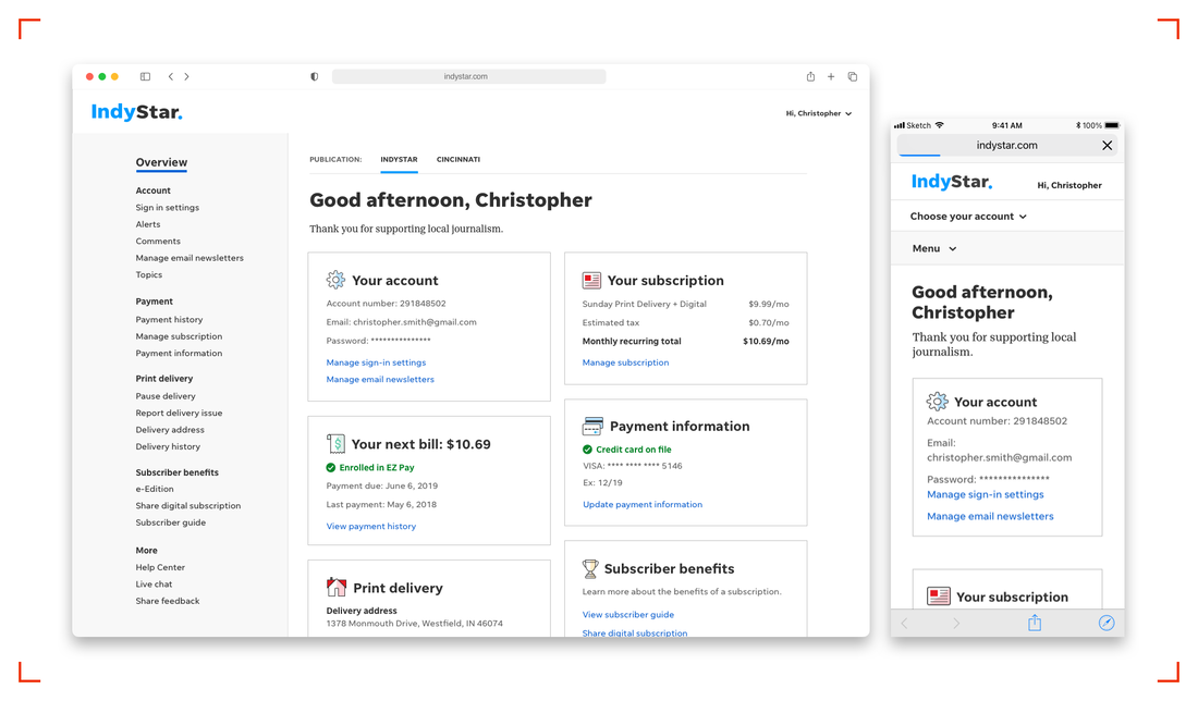
In late 2018, feedback on Gannett’s local sites revealed subscribers struggled to make routine updates to their accounts online. The UX team was tasked with learning why, and to work with the Subscription & Data Product (SDP) team to improve our account management experience.
Objective
Redesign our account management system to allow customers to easily manage their subscriptions online.
My role
I led UX research, which included:
Key methodologies + insights
1. System audit and baseline moderated user test
We focused on the user flows which received the most customer complaints: link a print account to a digital one, sign up for auto pay, change delivery address, manage vacation holds, and access billing history.
I worked with another designer on our team to audit the existing experience, documenting inconsistent and confusing UI and UX patterns to determine the biggest problems and opportunities for improvement. View the full audit here.
Through UserTesting.com, we screened and selected eight current subscribers of a local newspaper who had managed that subscription online in the past year. We created test accounts on IndyStar’s live site to replicate a real user’s experience as closely as possible. This testing validated many of the pain points we identified in the system audit and followed three themes.
In late 2018, feedback on Gannett’s local sites revealed subscribers struggled to make routine updates to their accounts online. The UX team was tasked with learning why, and to work with the Subscription & Data Product (SDP) team to improve our account management experience.
Objective
Redesign our account management system to allow customers to easily manage their subscriptions online.
My role
I led UX research, which included:
- An audit of the existing system
- Moderated usability testing at the beginning and end of the project
- Iterative unmoderated usability testing
Key methodologies + insights
1. System audit and baseline moderated user test
We focused on the user flows which received the most customer complaints: link a print account to a digital one, sign up for auto pay, change delivery address, manage vacation holds, and access billing history.
I worked with another designer on our team to audit the existing experience, documenting inconsistent and confusing UI and UX patterns to determine the biggest problems and opportunities for improvement. View the full audit here.
Through UserTesting.com, we screened and selected eight current subscribers of a local newspaper who had managed that subscription online in the past year. We created test accounts on IndyStar’s live site to replicate a real user’s experience as closely as possible. This testing validated many of the pain points we identified in the system audit and followed three themes.
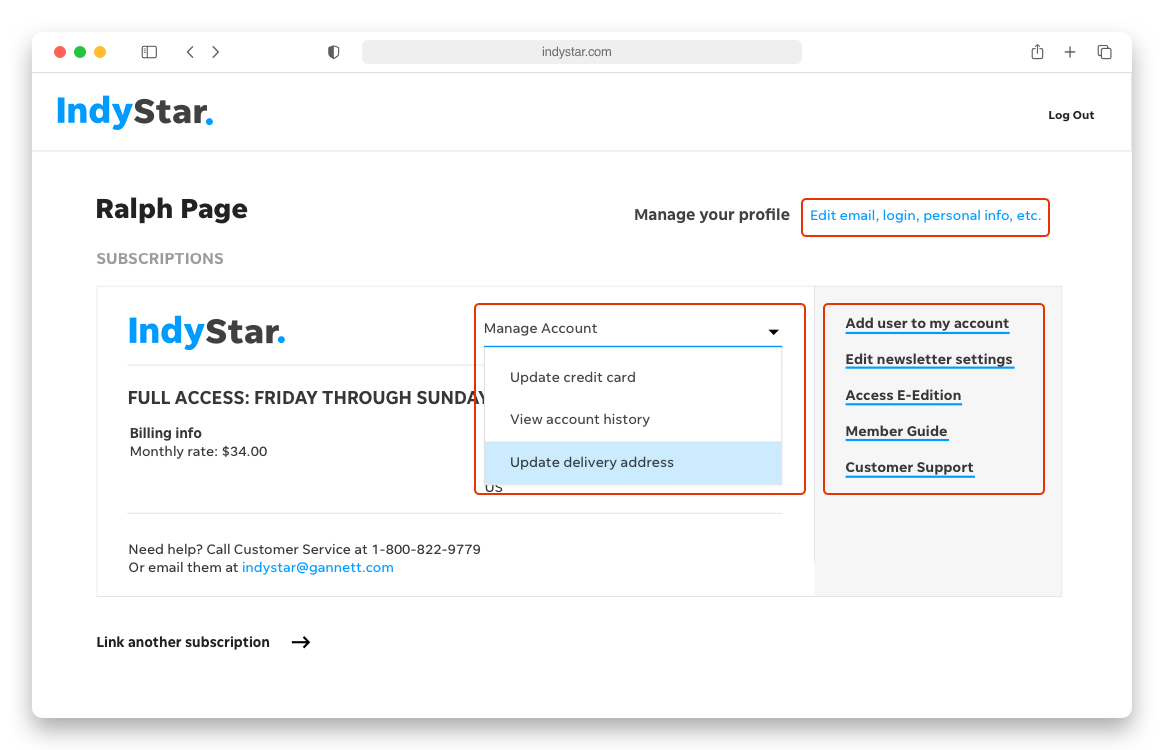
- Navigation: The account management homepage lacked organization and hierarchy. Links were split between three places, with several key links in a dropdown menu that users didn’t initially see. They also noted the lack of clear navigation between pages, with no persistent links or back buttons to provide a sense of place.
- Language and messaging: Confirmation and error messaging was often vague, unhelpful, or misleading. Links didn’t match their corresponding page headings or other on-page copy. Users did not feel confident they were on the right page or successfully made updates.
- Dashboard and data management: Users expected the account management homepage to function as a dashboard or overview of their account. They wanted to see any pending information changes or transactions reflected here.
2. User flows and UX copy
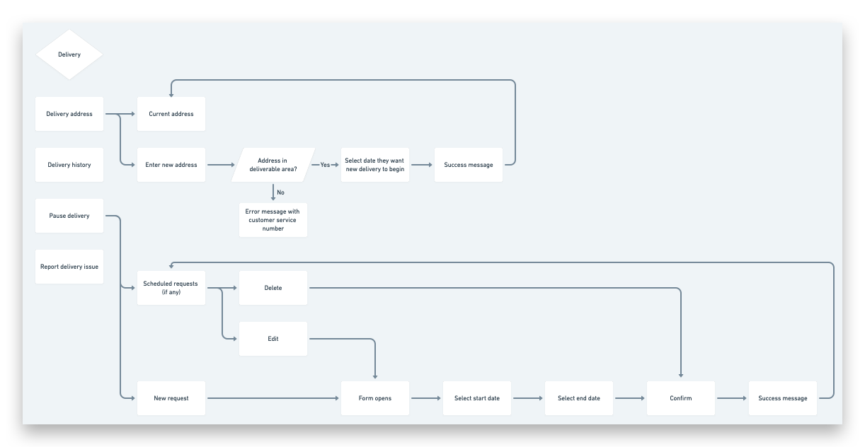
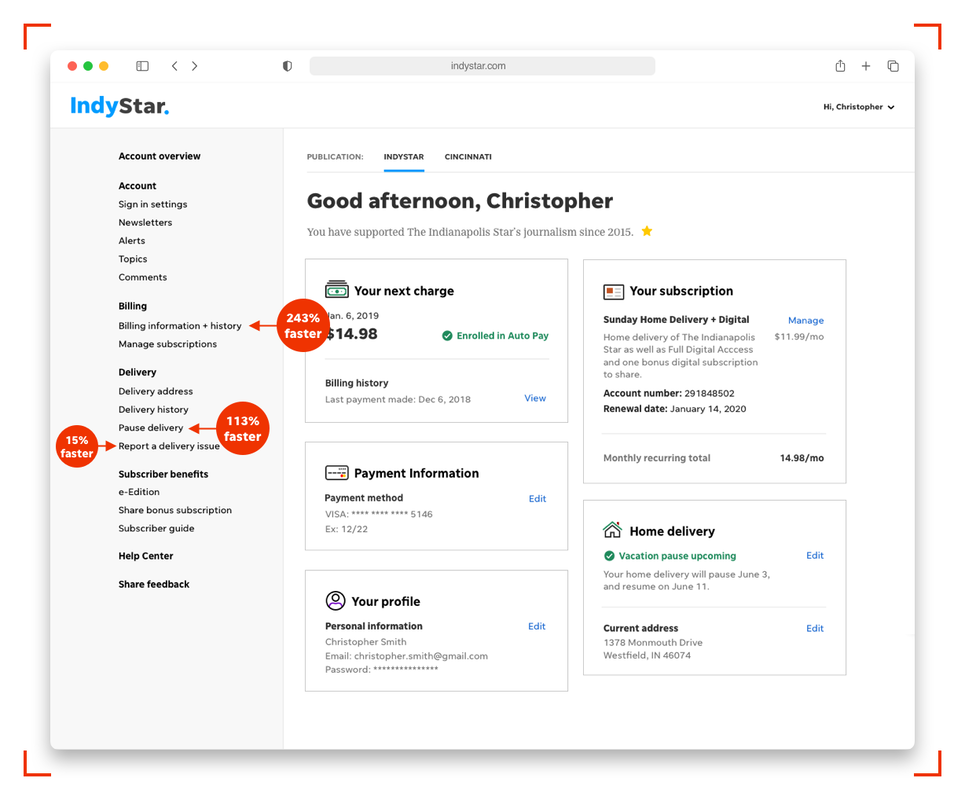
Following the moderated test, I mocked up a persistent navigation with links grouped by type (account, billing, delivery, etc.) and visualized the key workflows we identified in our baseline testing. View user flows here.
Following the moderated test, I mocked up a persistent navigation with links grouped by type (account, billing, delivery, etc.) and visualized the key workflows we identified in our baseline testing. View user flows here.
I also began rewriting all on-page copy for clarity and consistency while the UI designers created the key workflows for the first round of testing. I tested revised copy with low-fidelity wireframes so I could finalize language recommendations, secure legal approval, and pass them off to the development team to update the language on the current account management system ahead of the design rollout.
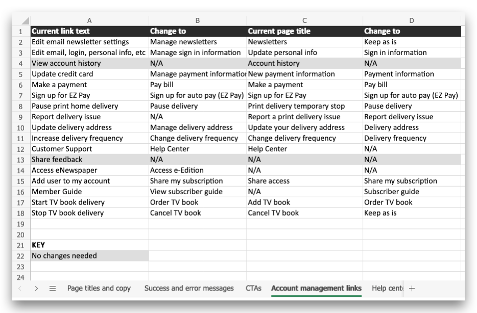
I worked with the product manager to document every link, error message, and piece of copy we’d need to change, including every site's navigation, the Help Center, and printed bills sent to customers.
I worked with the product manager to document every link, error message, and piece of copy we’d need to change, including every site's navigation, the Help Center, and printed bills sent to customers.
3. Unmoderated user tests and iterations
We used the moderated test as a baseline to validate if our changes improved user comprehension and ease of use. In one of our first tests, the copy and navigation updates helped users find the pause delivery link 113% faster and the billing history link 243% faster. Each unmoderated test was small — typically 5-8 users — allowing us to quickly observe what needed improvements in the next round of iterations.
We used the moderated test as a baseline to validate if our changes improved user comprehension and ease of use. In one of our first tests, the copy and navigation updates helped users find the pause delivery link 113% faster and the billing history link 243% faster. Each unmoderated test was small — typically 5-8 users — allowing us to quickly observe what needed improvements in the next round of iterations.
Outcomes
The redesigned account management system deployed to 100+ local markets, providing a unified customer experience dashboard powered by five different back-end systems. The remaining 150+ daily newspapers, many acquired in the late 2019 merger of Gatehouse and Gannett, will eventually be migrated to the new account management experience as they transition to a new tech stack.
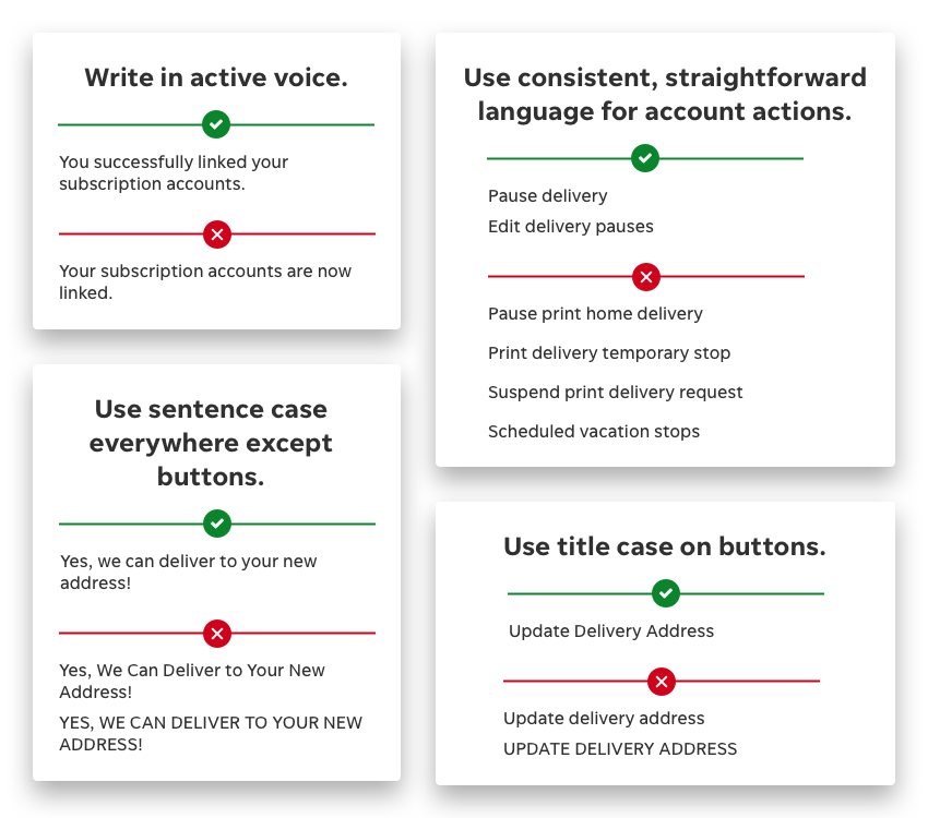
Using the extensive language insights uncovered in this testing, I created a PDUX style guide to ensure consistency in how we discuss accounts and subscriptions site-wide.
I also presented my process for rewriting and testing all UX copy for the account management at the DCUX 2019 Poster Session. View poster

